Task list pages
Experimental
This pattern is currently experimental because more research is needed to validate it.
This pattern is currently experimental because more research is needed to validate it.
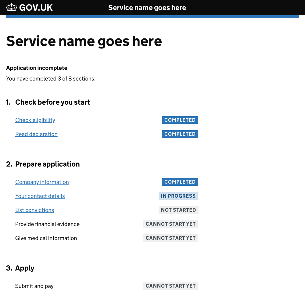
Task list pages help users understand:
- the tasks involved in completing a transaction
- the order they should complete tasks in
- when they have completed tasks
There is a coded example of a task list page in the GOV.UK Prototype Kit.
When to use this pattern
Only use a task list page for longer transactions involving multiple tasks that users may need to complete over a number of sessions.
Try to simplify the transaction before you use a task list page. If you’re able to reduce the number of tasks or steps involved, you may not need one.
How it works
You should show a task list page:
- at the start of the transaction
- at the start of each returning session
When using a task list page in your service you need to:
- group related actions into tasks
- show the status of the tasks
If there are lots of tasks to complete, you might also need to group them into sub-sections.
Group related actions into tasks
Group related activities and questions into tasks, for example, ‘Provide financial evidence’ and ‘Give medical information’. This will help users understand and plan what they need to do.
Where possible, task names should:
- describe what the task or activity will involve
- start with verbs, for example, ‘check’, ‘declare’, ‘report’
Show the status of the tasks
Include a summary above the task list to say how many tasks or sections have been completed.

Make it clear to users which tasks they’ve completed and which still need their attention, by labelling them using the Tag component.
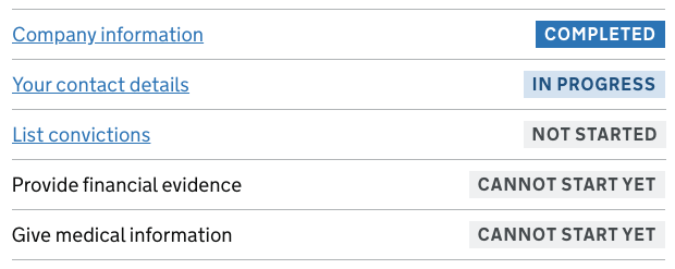
Use the following labels to describe the different states of a task:
- ‘Not started’ (in grey) if the user can start work on the task, but hasn’t done so yet
- ‘Cannot start yet’ (in grey) if the user cannot start the task yet - for example because another task must be completed first
- ‘In progress’ (in light blue) if the user has started but not completed the task
- ‘Completed’ (in blue) if the user has completed the task
Group tasks into sections
If your transaction involves lots of tasks, make it manageable by splitting it up into sections that represent stages in the process.
For example, you could group all tasks which help users find out if your service is right for them in a section called ‘Check before you start’.
Where possible, allow users to complete tasks in any order. This will help them plan their time and complete sections as and when they can.
Research on this pattern
This pattern was originally developed and tested by a team at the Government Digital Service (GDS).
The team built prototypes of task lists for 3 services, Register as a childminder, Learn to drive and Transport goods and tested them with 34 users over 5 rounds of research.
The pattern was iterated after each round of testing.
You can read more about testing and iterating the task list page pattern.
In the original pattern only completed tasks were labelled. Some users did not realise they had to complete all the tasks before they could continue, or thought that they had completed the whole transaction.
The pattern has now been iterated to include labels for all statuses and a summary above the list.
Known issues and gaps
User research and feedback on this pattern has shown that:
- some screen reader users are frustrated by having to tab through every section each time they return to the task list after completing a task
- some services need users to complete tasks in a particular order, for example, a user must fill in an application before they can pay
- once a few tasks have been completed it becomes harder to scan the page and spot incomplete tasks
More research is required to establish whether or not users of screen readers struggle to perceive tasks that cannot be started yet, because they are not marked up with hyperlinks.
Services using this pattern
This pattern has been used in a number of services, including the following.
Ministry of Justice
Apply for probate
Money claims
Ofsted
Register as a childminder
Next steps
Work is needed to ensure that users can understand the difference between completing a task and completing the whole service.
In addition, more user research is needed to find out:
- how to help screen reader users to get an overview of the progress they have made through the task list
- whether to return users to the task list after each task or take them straight to the next task in the sequence
- the best way to show when tasks must be completed in a fixed order
- how to ensure users can see which tasks have been completed and which they still need to do
If you’ve used this component, get in touch to share your user research findings.
Help improve this page
To help make sure that this page is useful, relevant and up to date, you can:
- share your research or feedback on GitHub
- propose a change – read more about how to propose changes in GitHub
Need help?
If you’ve got a question about the GOV.UK Design System, contact the team.